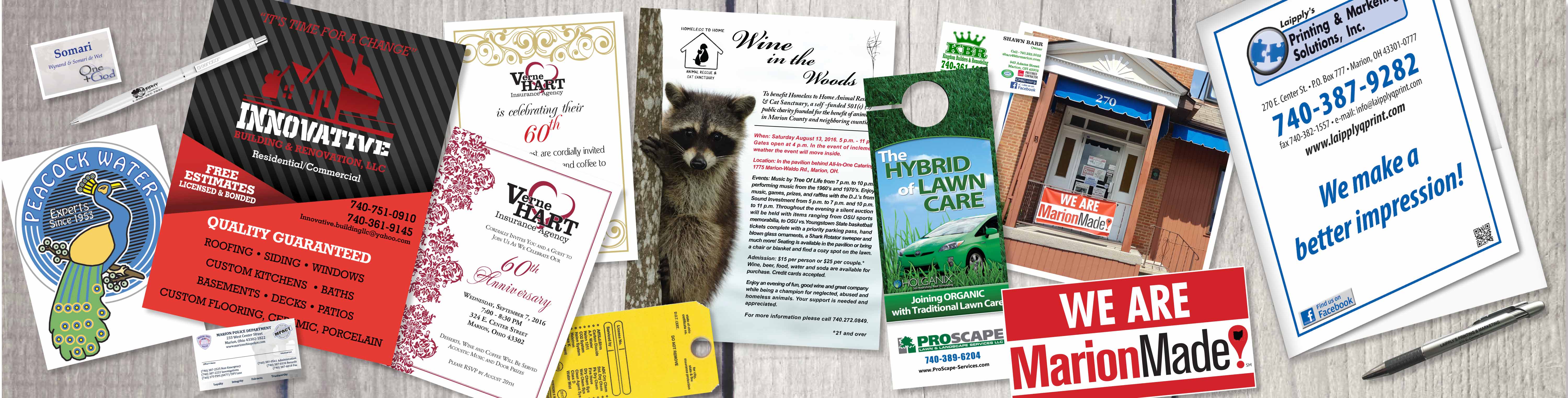
WE CAN DO THAT!
Printing and Copying
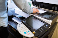
Utilizing digital computer-to-plate technology and shades of specific inks, we can print your documents in stunning clarity on myriad paper stocks, using any specifications you choose.
Graphic Design
We love to design for our customers! Our knowledgeable staff of Graphic Designers will be glad to talk you through the process and create a unique and beautiful piece specifically for you.
Bindery
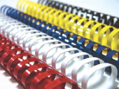
We know that clean folds, accurate trims and fine binding are as important as the print quality achieved on press. At Laipply’s, our bindery department does it all, and much more!
Direct Mail

Your mailings can be stuffed, sealed, addressed and delivered to the post office without you ever lifting a finger. From inbox to mailbox….we’ll handle it all!
Follow Us on Facebook

Laipply’s Printing and Marketing Solutions Inc. proudly stands with other community businesses and leaders in support of the vibrant community that is Marion, Ohio.
Upload Your Files

Missed our Facebook Live Videos?
If you missed our Facebook Live Video for the week, you can view current and past videos in our Facebook Live Video Archive.
![]()
![]()
![]()
![]()